A rebrand is like a wardrobe change — switching brand colours from blue to green can say as much as a change from a biker jacket to a pink knitted sweater. All manner of circumstances can lead to a rebrand.
Here we examine five different rebrand scenarios and their results.
1. New offerings | Seven Clean Seas flush their old image
Seven Clean Seas (SCS) are on a mission: rid the oceans of plastic for good. But it’s not just the seas they’ve cleaned up. Their new B2B offering also necessitated a refresh of their entire visual identity.
SCS are now offering businesses a plastic footprint offsetting service, so they needed their branding to chime with corporate ears as well as the everyday world.
Leaving behind the marine blue of their old selves, SCS channelled urgency and utilitarianism with a fresh lick of high-vis yellow. Their new logo, a mutable grid of ocean currents, is used throughout the brand for an impressionable identity.
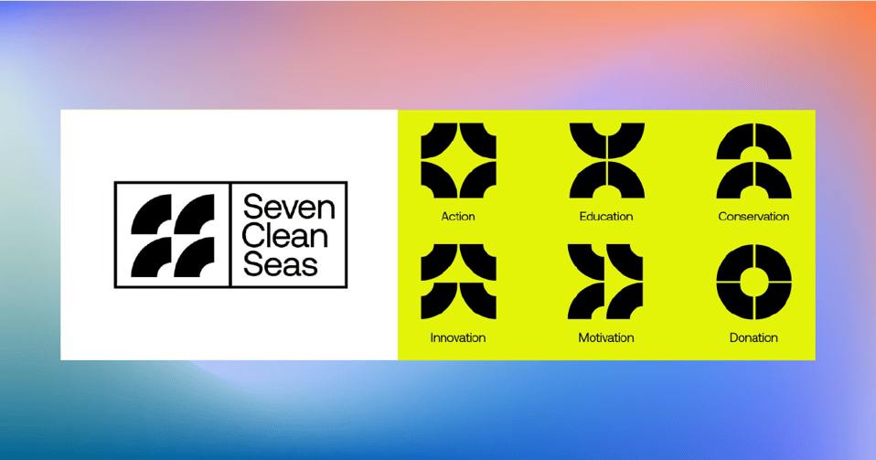
This progressive type of branding is successful because it avoids sustainable clichés, helping SCS build stronger corporate partnerships.
2. Brand consistency | Wavemaker rebuilds around ‘positive provocation’
How does the world’s second largest media agency, with over 7,000 employees and offices across the globe, keep their brand consistent? What began as a mini brand refresh for Wavemaker soon evolved into an exciting and comprehensive rebrand.
By embracing simplicity, Wavemaker captured the confidence and constructivism of their new positioning: ‘positive provocation’. The bright orange of their old brand was maintained so that designs are always connected with their logo.
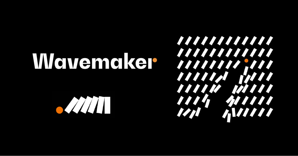
Within a monochromatic canvas of dominos, Wavemaker's orange circle disrupts the balance of designs, placing attention on the playful disruption of ‘positive provocation’.
The success of this rebrand lies in its simplicity, making it easy to implement across Wavemaker’s various offices and territories.
3: Mergers | Williams Murrary Hamm tie the knot with Identica
When two brand agencies work together for several years and collaborate successfully, when they like each other very much… they merge, just like Williams Murray Hamm and Identica.
WMH&I was formed, in a sandwich of their prenuptial names. A new, unobtrusive visual identity places the spotlight on their work and avoids any dissonance from old identities.
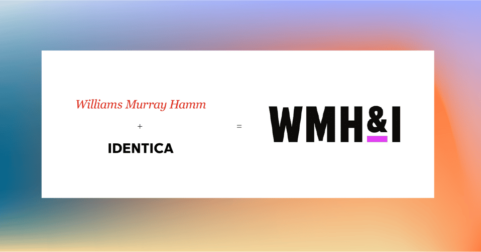
White, black, and a rich mauve create a distinctive frame for WMH&I’s work, ensuring this merger is marked by clean palette and clear direction.
A merger can often lead to a Frankensteined identity. But in this case WMH&I, while nominally a blend of agencies, speaks with one voice through a strong visual identity.
4. Strategic pivots | Foursquare goes back to square one
After a pivot to the B2B and Software as a Service industries, Foursquare (providers of location data for services), went back to square one with a comprehensive rebrand.
A typographic logo in Authentic Sans replaced the cartoonish qualities of the old Foursquare logo. They also created a mature colour scheme with a digital combo of blue and black, enhanced by a gradient of orange.
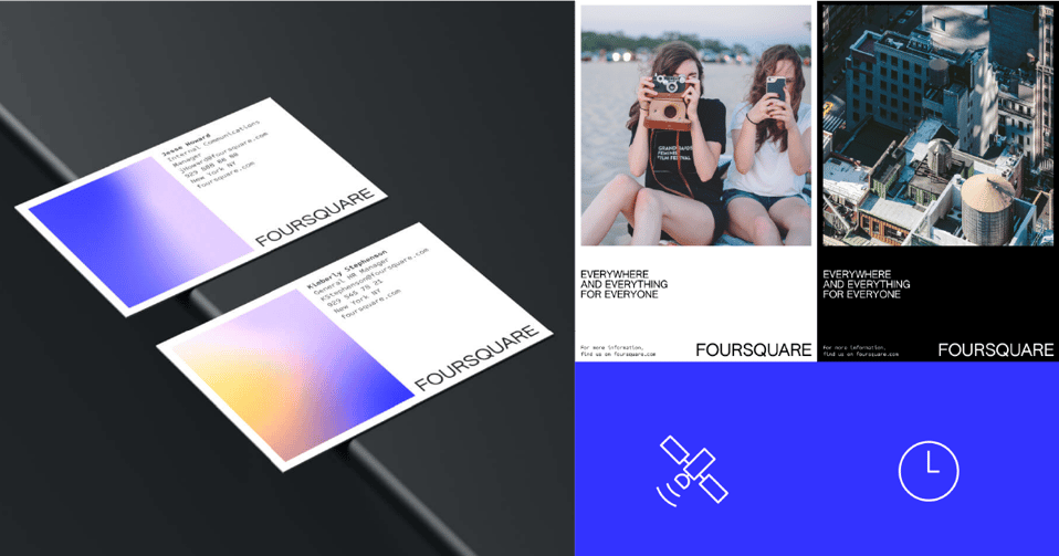
Foursquare’s minimalist designs speak for control and accuracy in their lines and layout, a useful visual complement to the service Foursquare provides.
As Foursquare realised, a strategic pivot should be used as a launching point from which brand identity can be taken in exciting new directions.
5: Personality changes | Tranch and the cutting edge
You're new on the scene, how do you dress to impress? Tranch entered the fintech B2B zone ready to do it differently, with their ‘buy now pay later’ services for businesses.
To make a splash, they branded with bright pastel colours and a theme of sharp edges. Tranch is taken from tranche — the French root of which is ‘to cut’ — a strong source for its visual personality which emerges in knives and sliced up shapes.
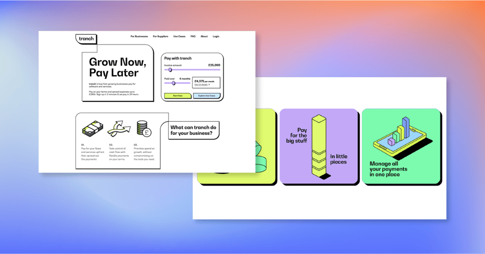
Rebrands that target a personality change need to look inwards like Tranch, before they project themselves outwards. Tranch’s characterful branding helps it stand out in the typically dense and dry world of finance.
Thinking of a rebrand?
Whether you’re undergoing a strategic pivot, a personality change, or a merger, having a strong brand is an important point of distinction. It sets you apart from the competition and can improve your lead-gen activities. Whatever your motivation for a rebrand is, make sure you understand it thoroughly before diving into the creative.